The Ultimate KPI Dashboard for DTC Growth Leaders
The Executive Problem: Data Chaos
E-commerce leaders deal with a constant reporting challenge. Revenue is tracked in platforms like Shopify or IdoSell, traffic data comes from GA4, and advertising results are split across Google, Meta, and TikTok. Each system shows only part of the picture.
This fragmented setup makes it difficult to build a complete and consistent view of performance. Leadership teams spend hours combining exports, reconciling discrepancies, and explaining why numbers don’t match. The outcome is slower decision-making and reliance on intuition instead of reliable, unified data.
What changes when everyone sees the same numbers?
When all key metrics come together in one place, everything changes. A unified Key Performance Indicators (KPI) Dashboard eliminates the weekly reporting chaos, saving hours of manual work spent reconciling data from different systems.
With one standardized view, every member of the leadership team operates from the same trusted numbers. Meetings stop being about debating which report is correct and become focused on what actions will drive the next phase of growth. This shared visibility transforms conversations from reactive to strategic — from “What went wrong?” to “What’s our next move?”
The Big Questions
Every leadership team faces the same fundamental questions:
- Revenue and profitability: Are we growing sustainably and profitably, or just chasing topline sales?
- Acquisition efficiency: Are we acquiring customers at a cost that fuels long-term growth, or are rising CACs eroding margins?
- Conversion funnel: Where are customers dropping off, and how much potential revenue is lost along the way?
- Products and AOV: Which products are truly driving revenue, and how is average order value changing over time?
- Data reliability: Can we trust the numbers enough to make high-stakes decisions quickly and confidently?
How the KPI Dashboard answers these questions
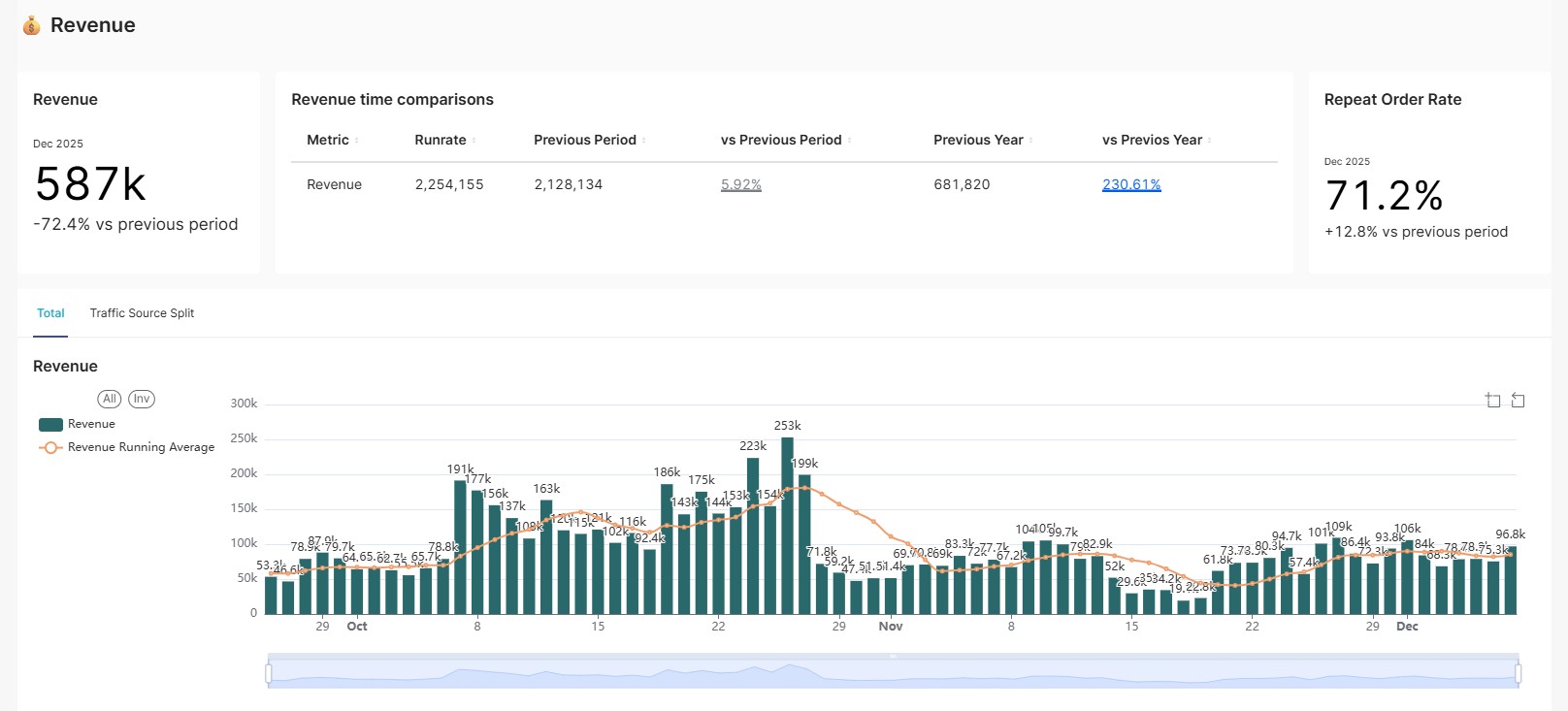
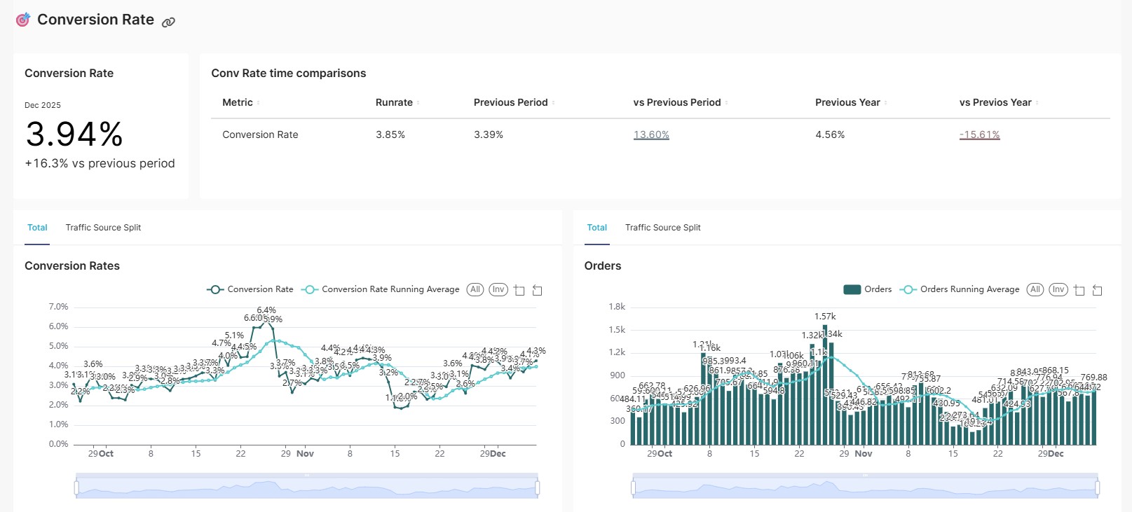
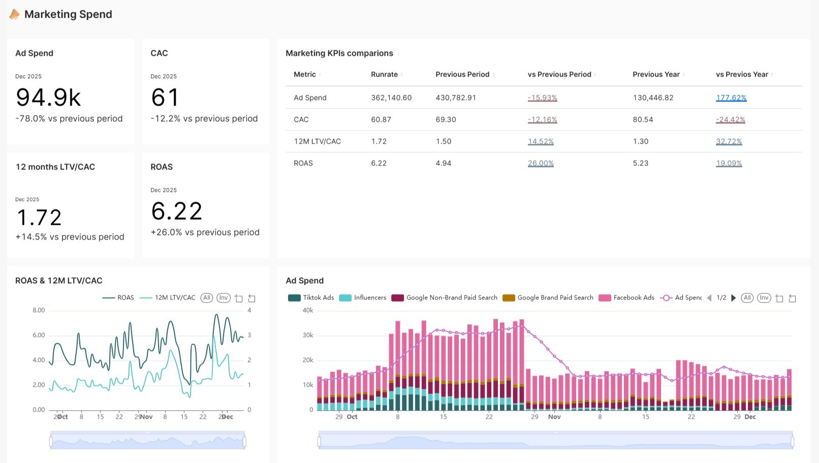
The Ultimate KPI Dashboard brings every key metric into one place – a single scrollable page that gives leaders a full picture of business performance without switching between tools or reports.
Run rates and time comparisons provide instant context, helping executives understand not only today’s results but how they stack up against previous periods. Moving averages filter out daily noise, revealing the underlying trends that highlight momentum or emerging risks before they show up in the P&L.
A simple marketing channel filter allows teams to instantly compare performance by source, making it clear which investments are driving real, sustainable growth.
The Executive Payoff: From Data Silos to Growth Alignment
The impact goes beyond cleaner reports — it transforms how leadership teams work.
At Coffee & Sons, we needed a consolidated view of our key business metrics to quickly grasp the overall performance of the company. Together with the Sublime team, we created a KPI Dashboard that has become the natural starting point for our daily analyses.
For management, it’s a particularly practical tool — during meetings we have all the key numbers at hand and can immediately verify results and assumptions. And when we need to dive deeper, we simply turn to more detailed dashboards. This solution saves time, brings order to our data workflow, and gives us confidence to make decisions based on facts.
–Grzegorz Czechowicz, Head of E-Commerce at Coffee & Sons
With silos removed and alignment achieved, leadership teams can focus their energy where it truly matters — on driving growth, not debating numbers. Conflicting reports don’t have to block your decisions – book a free demo and see how the KPI Dashboard helps leadership teams align around one version of the truth.
Contents:
Contents: